This post was written by Rich Bosomworth.

Discover the acclaimed Team Guides for Software – practical books on operability, business metrics, testability, releasability
Information visualisation is used for visually representing data to reinforce and enhance cognition. When deploying infrastructure as code, this visual perspective of resources and their relationships can prove useful, both at the design stage, and also post deployment for purposes of troubleshooting and infrastructure development. In this post we take a look at how to achieve visual outputs for Terraform plans using auto-generation.
As discussed in previous posts, Terraform is an infrastructure orchestration tool. Configuration management tools such as Ansible use a procedural language and method of deployment, whereas the Terraform language is declarative. This means that only the end state need be described (or declared). Terraform will work out the deployment route to achieve it. The necessary building blocks (resources) must be specified, however they do not need to be arranged in any particular order (unlike Ansible). Using providers (i.e for AWS, Azure etc) Terraform is intelligent enough to work out resource dependencies and deploy them in the correct order.
Being able to visualise these internal infrastructure relationships helps us to understand how Terraform created them.
Installation and use
Terraform already contains a ‘graph’ command for outputting tf plans. The advised utility for converting these outputs into a graphical format is a tool called Graphviz.
Let’s take a look at how to install and use Graphviz on Ubuntu Linux 17.04.
Firstly, we need to install the tool and other dependencies:
$ sudo apt install graphviz python-pydot python-pydot-ng python-pyparsing
libcdt5 libcgraph6 libgvc6 libgvpr2 libpathplan4
Next, we need to generate the graphic file.
Run the following command from inside the Terraform plan DIR (i.e the folder that contains the .tf file or files):
$ terraform graph | dot -Tpng > graph.png
The resulting .png file can be opened with any image viewer. It shows the visual relationships of all resources.
*NOTE* – In order for the utility to work the plan MUST be initialised, either to local or remote state. Initialisation pulls down the relevant infrastructure provider, which is required to formulate the resource relationships.
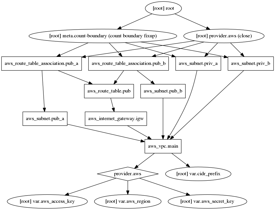
Example
To demonstrate output for simple deployment, here is the Graphviz produced output file for our basic VPC plan.

You can see how the vpc components stack up and feed into the aws_vpc_main core resource, and how the main vpc itself relies on supporting aws resources for deployment (access keys, region & provider).
Conclusion
Infrastructure visualisation can be a secondary consideration when designing or enhancing a cloud platform. As demonstrated, when using certain technologies it can be implemented at an auto-generated level with little or no overhead. Auto-generated results may not deliver the comprehensive polish of a well constructed Gliffy or Lucidchart schematic, however they are significantly quicker to produce and offer a raised level of design and diagnostic awareness for basic to mid-level deployments.
